By Doug Noonan
We typically distill big data down to one or two big numbers. Soundbites for statistics. This is fitting, because the point of analytics is to distill complex realities and data to digestible insights. So, get your key stats and cool infographics as takeaways!
Yet behind the big numbers, there is usually a lot of nuance. The whole story needs more explanation. Slice the data another way, you might see something different. That’s OK, too, because complex situations are … complex. Embrace it. Sink your teeth into it. (That’s why we give you the tools here at ArtsAnalytics to interact with Visualizations and to be able to Create your own.)
For example, take the “arts and cultural economy” metrics. You can get a big number for the whole USA. But what does that tell us about NYC vs. LA vs. NOLA vs. KC? We all expect much of the arts economy to concentrate in the big coastal cities, but what about ‘flyover country’? The national averages might obscure some important realities on the ground. And what’s happening in motion pictures might not be the same for museums or music.
We teamed up with Arts Midwest to spotlight the midwestern region and glean some lessons for the cultural sector in the heartland. We’ve just released three great writeups on the region’s cultural workforce, on their earnings, and opportunities for growth. I invite you all to go check ‘em out now. (Then return here.) I’ll wait!
The Arts Midwest briefs show a midwestern creative economy that punches at its weight on jobs per capita and per-job pay – even if total scale still trails the coasts. The region’s edge is design-and-build and creative manufacturing, while the biggest upside is in digital media and independent creator sectors. The mandate is clear: invest in content and creators, leverage venue momentum, and tailor state strategies to convert strengths into durable growth.
We’ve taken the data behind the Arts Midwest data briefs and posted them here for you to play with. Dig into it. You can see for yourself how the (per-capita) value-added from the arts and cultural industries tend toward the coasts. Click on “Create”, then click “Map” then select the ACPSA. Then just pick VApcall (value-added, per-capita, all arts-and-culture industries). This map shows the coasts’ strengths. But a mouseover of the states will show you the values for Illinois and Minnesota (both $3K/person), for instance, exceed the values for Texas and Florida (both $2K/person).
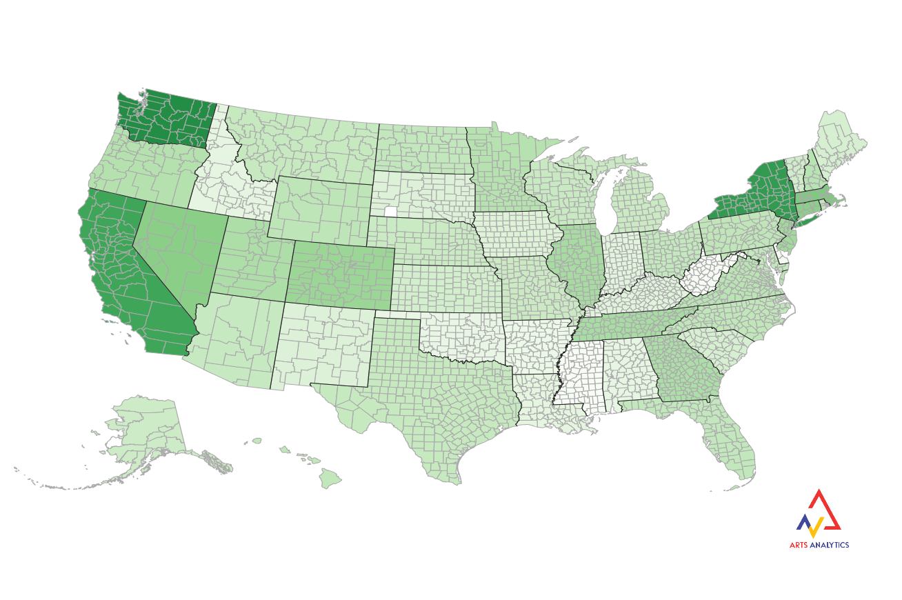
Keep digging. Change the data point to Emppccore (employment, per capita, core industries only), and you’ll see a different patchwork of colors across the country. New York still stands out, but the Midwest holds its own for employment in the core, creative industries.
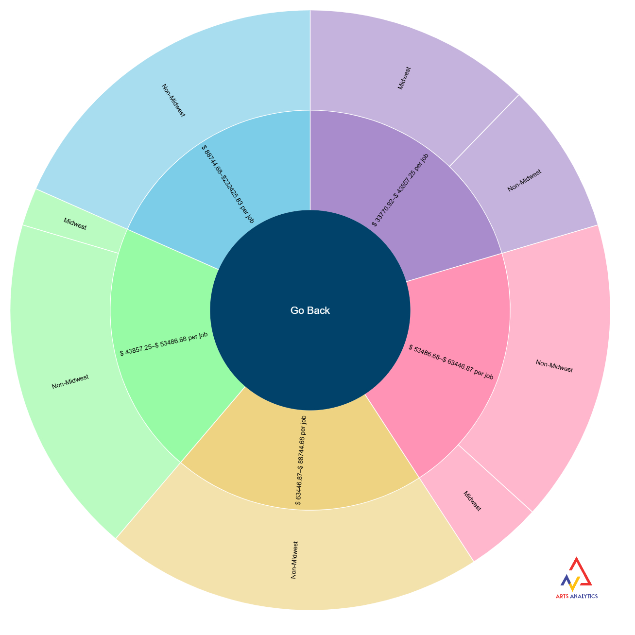
Dig further to break it down by different industries. We can split states into quintiles (i.e., the lowest 10 states, next lowest 10 states, etc.) in terms of compensation per job in the arts and cultural economy, and look at the share of each quintile occupied by midwestern states. The zoomable pie graph is telling. If the Midwest was like the rest of the country, we’d expect it to have roughly the same share of each quintile. Instead, we see a bigger share for Midwest states at the lowest compensation groups and the smallest shares at the highest. (Thank heavens for low cost of living?) Try it out yourself. Click “Create”, then “Zoomable”, and then the ACPSA dataset. For Data Point #1, pick something like ComppjIndependent_Artists (compensation per job for independent artists) and Midwest for Data Point #2. You’ll see how the midwestern states don’t even register in the top two categories of pay (top 40% of states) and are overrepresented in the lowest categories. Make this graph yourself, and you can click on different categories for interactive zooms.
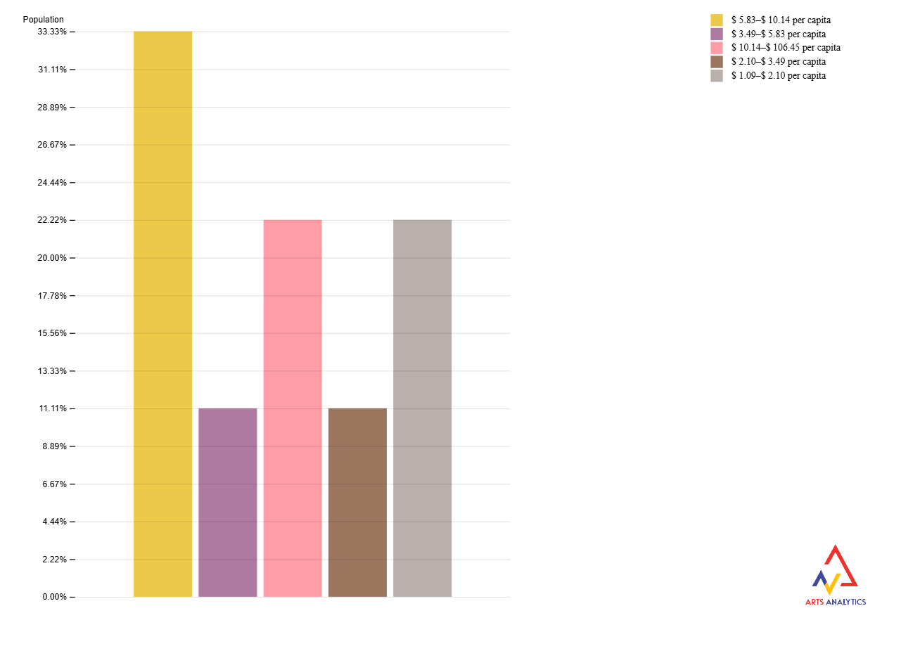
Other visualizations are possible, too. You can see how the 9 midwestern states fare in a group like Industrial Design, one of the region’s strong suits. Click “Create”, then “Bar”, and then pick the ACPSA dataset. Then, select the Data Point #1 as “Midwest” to set the Value to “Midwest”. Finally, pick a Data Point #2 such as VApcIndustrial_Design to see the value-added per capita in this industry. The 5 bars indicate the 5 quintiles (i.e., top 20%, next 20%, etc.) across all the US states. We’d expect about 2 midwestern states in each group if they were ‘typical’ of the country as a whole. Instead, we see more in the second-largest category ($5.83-$10.14 per capita in $1000s) and less in the lower categories ($2.10-$3.49 and $3.49-$5.83). While you’re there, look at VApcMusical_Instr manufacturing as another example where the Midwest excels, or VApcMotion_Pictures where it doesn’t.
As we should expect, the data tell a mixed story. Narratives are often messy. Getting your hands dirty with the data can help us all to move beyond anecdotal evidence. The results might surprise you. Or at least empower you with better evidence.